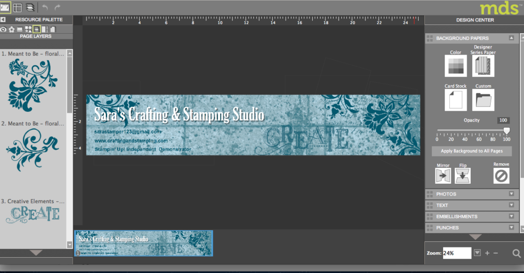
I hope that you like my new blog header and shopping button 
I used our MDS (My Digital Studio) programme to design them both.
Neither of them took that long to create, in fact I did them whilst I was watching tv. They both only use the base content of the programme – no need to purchase extra downloads.
I kept things simple by going for a monochromatic look and got a few variations in colour depth by changing the opacity of the various layers. There’s a button under the heading Resource Palette, called Page Layers (5th button along) that lets you alter the order of your layers so that I could move my text over the top of the flower stamp even though I’d created it earlier.

The colour scheme is Midnight Muse. Both the header and button use Number One DSP for the background. Stamps from Meant To Be, Creative Elements and Downtown Grunge were all used on the header and text was added to both.
For the header I was able to let my blog programme (WordPress) resize the image for me and then for the button I used another programme to resize it (Photoshop because that’s what I’m used to, but there are plenty of others out there that can do the job cheaper).
I should be able to update my blog style a little more often now that I have MDS 
Don’t forget that you can get a FREE 30 day trial of MDS to give it a test drive.
Sara xx


0 Comments