
Yesterday I shared the new In Colors with you. Now I know that one of the questions I’ll get asked frequently (and one that I always have when we get a new bunch of colours) is how do they compare with what we’ve got already?
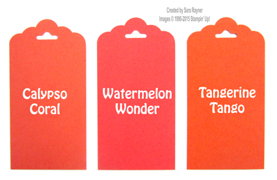
So here is how the colours compare with what I think are their closest neighbours apologies – the light has been poor today so my photography may not give the truest colours, but hopefully it gives you an idea. (If you’re not interested in the comparisons then simply scroll down to see a completed In Color card).
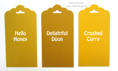
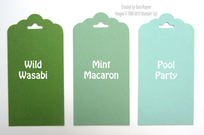
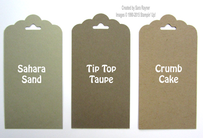
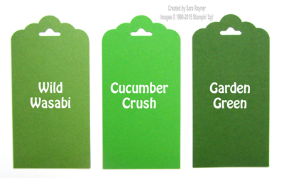
In each case, the new In Color is the centre tag.
Delightful Dijon – if you miss More Mustard then this is a close substitute. It’s darker than our current yellows and great for autumn and masculine.
Mint Macaron – a blue-grey green in the subtles palette. Ideal for when you need a cool green.
Tip Top Taupe – a new neutral that tends towards the grey. Darker than Crumb Cake but still on the cool side of the colour spectrum.
Cucumber Crush – a bright primary green that grabs attention. A little goes a long way.
Watermelon Wonder – another bright, attention grabbing shade, this time of orange-red.
We’ve teamed Tip Top Taupe and Watermelon Wonder to make this card.
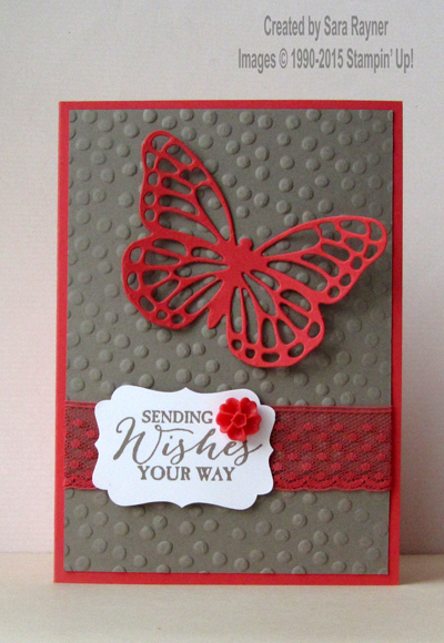
The card base, butterfly and ribbon are Watermelon Wonder and the textured background and stamped sentiment are Tip Top Taupe. Whilst the stamp set and dies used here aren’t new, we know that there has been some difficulty getting hold of this Butterfly Basics bundle. The good news is that both the stamp set and dies have carried through to the new catalogue and they will still be available as a bundle to make 15% savings!
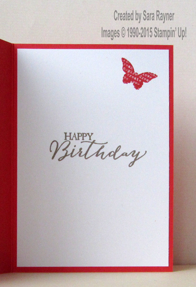
Another sneak peek tomorrow so please stop by.
Sara xx


0 Comments